Baltisches Haus continues the change by renewing its brand and visual identity
Published 2021-02-18
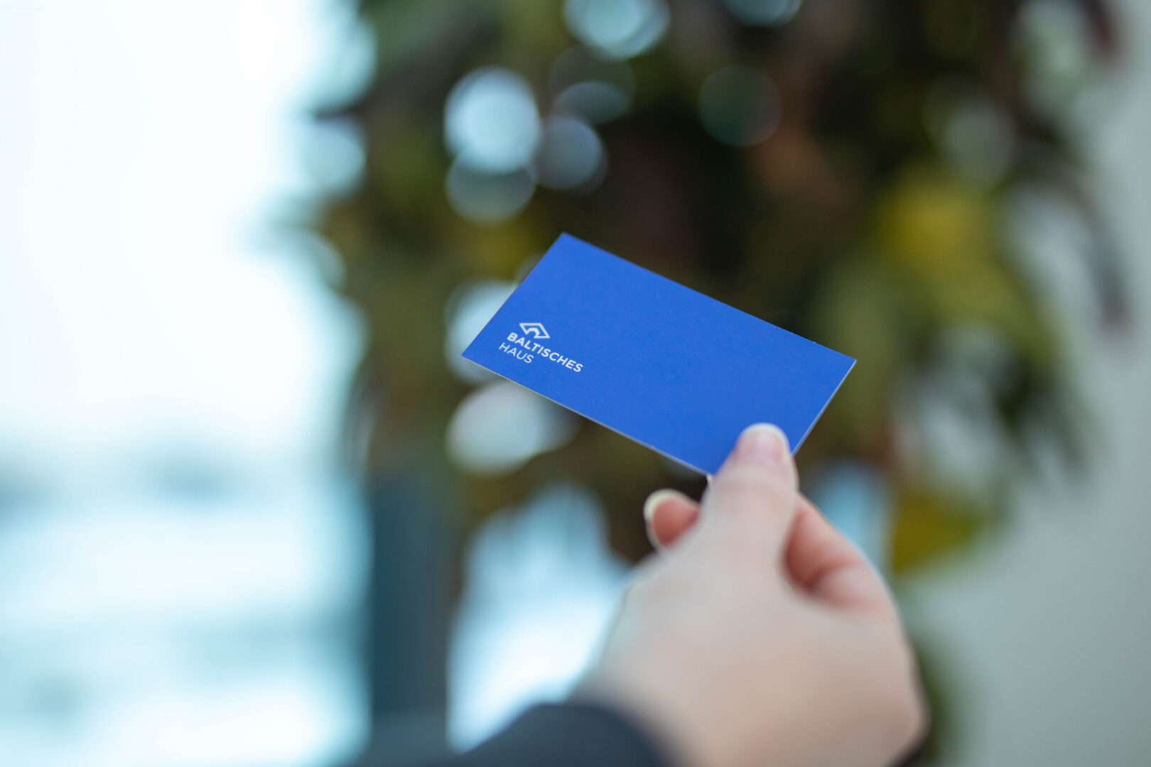
Baltisches Haus, one of the largest Lithuania’s commercial real estate development and management companies, renewed its brand and visual identity after fifteen years. The need to renew was driver by the aspiration to emphasise the company’s independence, the experience accumulated in the commercial real estate sector, and modernity.
“Baltisches Haus has been on the market for more than 25 years, and for the last three years we have been operating as an independent commercial real estate development and management company. These three years have been a time of change for us, thus, there we have a need to look for visual novelty as well”, says Asta Ušparaitė, Marketing Project Manager of Baltisches Haus.
Despite the need for renewal, the Baltisches Haus brand was changed minimally to maintain the recognition and value it has gained over fifteen years.
“We evaluate the current brand, therefore we decided not to change the graphic image of the brand. We only changed the hue, proportions, text font, and layout. It was sufficient for the brand to become more contemporary, expressive and live. That was sufficient to make the brand more modern and easier to adapt in the digital space. It metaphorically conveys the nature of the company’s business and directly represents its name. The impression of novelty is also provided by completely new colours and graphic elements introduced in the style guide”, says A. Ušparaitė.
The brand also reflects the core principles that Baltisches Haus has been following for decades in creating spaces for business.
“People and the surrounding environment are our priority in creating spaces for business. Therefore, when developing projects, we assess the person, his physical and emotional state in the building and the building itself in an urban context as a whole. In the graphic symbol of the sign, this is represented by the three connected corners of the diamond”, says A. Ušparaitė.
The Baltisches Haus brand and identity have been renewed by Monotwo digital design studio.
2024-03-28
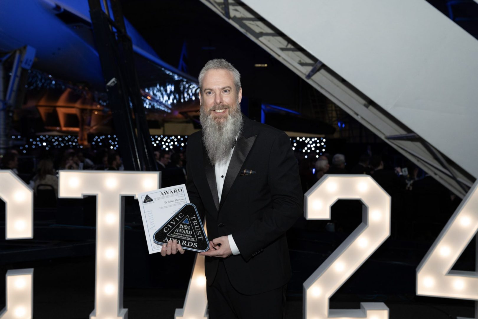
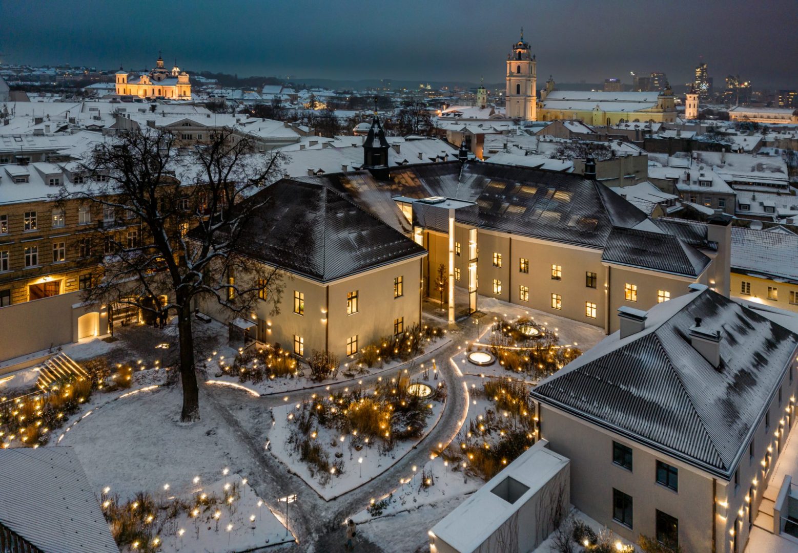
Bokšto skveras – a winner of the prestigious architecture competition
2024-03-12
The ISO 50001 certificate has been renewed
2023-12-13
Bokšto skveras achieves another international award
2023-10-11
Baltisches Haus Shopping Centre Receives Updated BREEAM In-Use Certification
2023-09-12
Baltisches Haus and Ignitis have entered into a strategic partnership agreement

2023-07-03
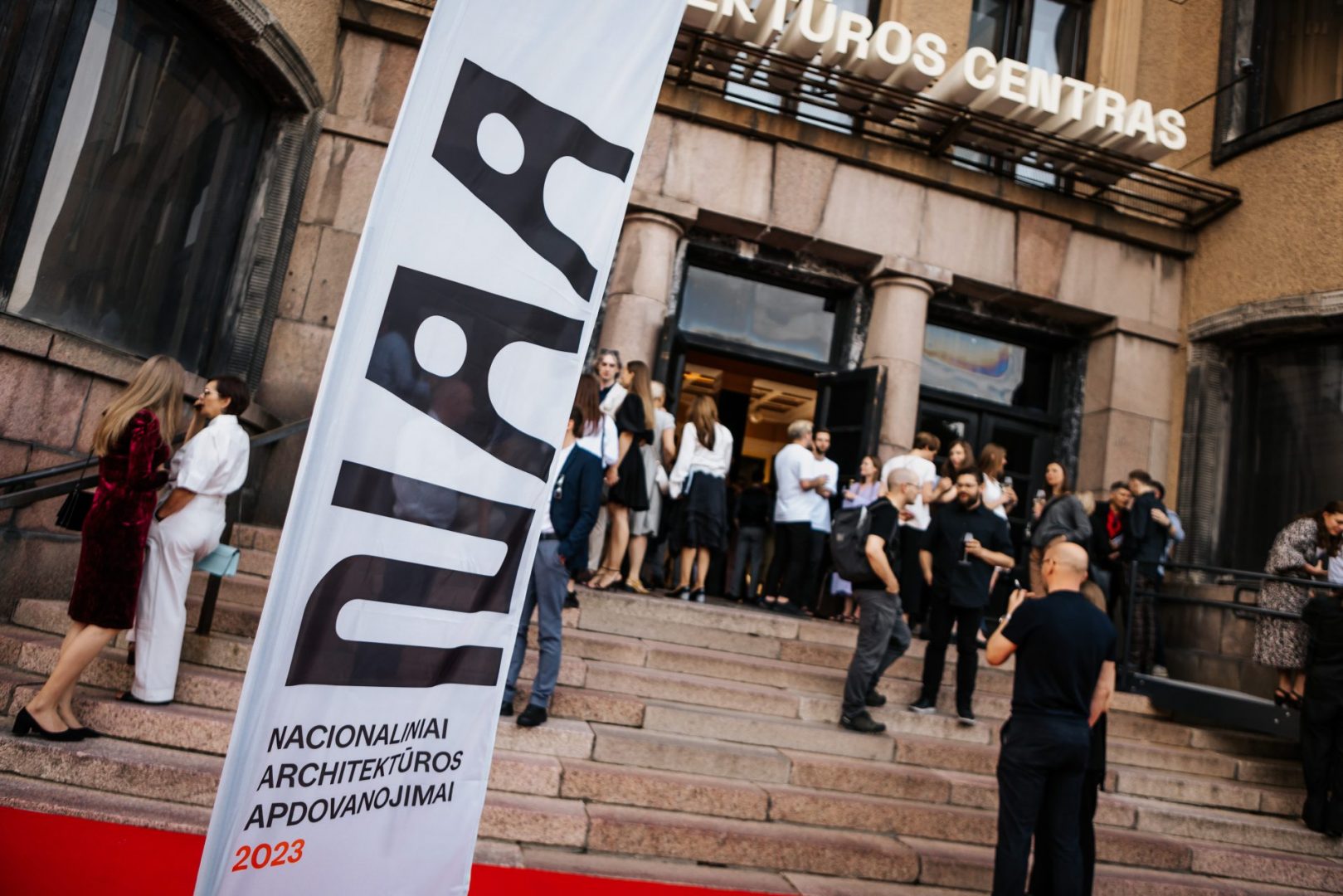
The creators of "Bokšto skveras" have won the main prize at the National Archite...